Coffee & Sons
Roastery
︎︎︎ Client:
Dmowski.Co
︎︎︎ Scope:
logo design, packaging
︎︎︎ Illustration:
Jan Kalwejt
Coffee & Sons roasting plant existed for 10 years under the name Kaffe 2009, relying mainly on deliveries to caterers. The retail market for coffee beans is growing rapidly in Poland, so they decided to change their business strategy and develop e-commerce. In addition, the name Kaffe 2009 was too generic and difficult to
position.
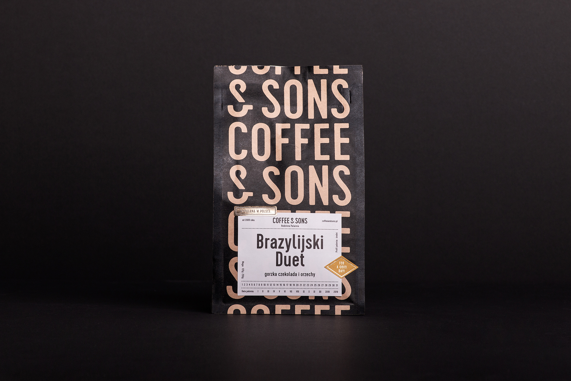
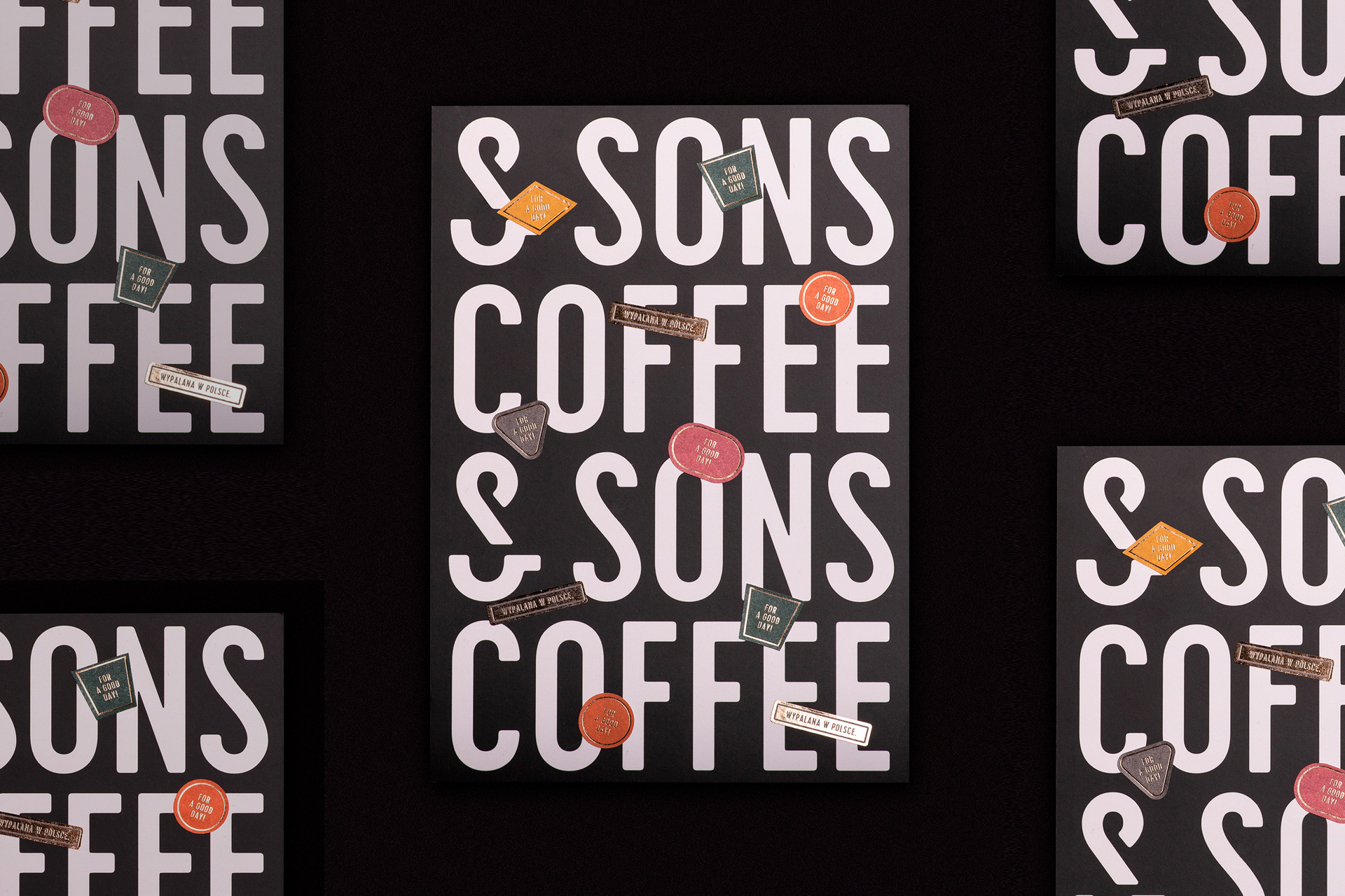
The roaster is a family coffee business, brought together by three generations - son, father and grandfather. Genuine relationships, closeness, different perspectives and experiences make the roastery a unique place.We decided to base the new strategy and brand identity on these values.We proposed a new name that communicates the values of the brand. The design of the visual identity was based on the Coffee&Sons logotype, which through multiplication creates a background for packaging and promotional prints. The choice of packaging materials and graphic assets gives the brand an artisanal and nostalgic feel.
position.
The roaster is a family coffee business, brought together by three generations - son, father and grandfather. Genuine relationships, closeness, different perspectives and experiences make the roastery a unique place.We decided to base the new strategy and brand identity on these values.We proposed a new name that communicates the values of the brand. The design of the visual identity was based on the Coffee&Sons logotype, which through multiplication creates a background for packaging and promotional prints. The choice of packaging materials and graphic assets gives the brand an artisanal and nostalgic feel.